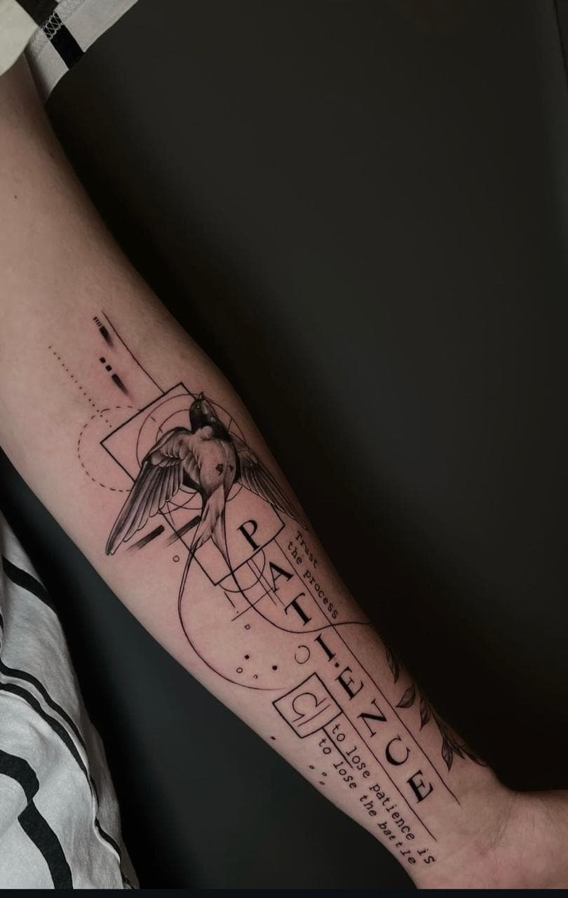
Why Words Are Harder Than They Look
Lettering is one of the most requested kinds of tattoo and one of the most unforgiving. An image can absorb small imperfections. Flowing linework can hide a wobble. Text cannot. A misspelled word, an awkward curve, or a letterform that was too fine on the day will keep announcing itself for as long as the tattoo exists.
Choosing a phrase is the easy part. Choosing a style of lettering that will still read clearly in ten or twenty years is the real design decision.
The Letterforms That Age Well
Broadly, tattoo lettering falls into a few families, and they do not all hold up equally.
- Serif — letterforms with small finishing strokes at the ends of the main strokes. Sober, classic, and readable, they work well at almost any size above the practical minimum.
- Sans-serif — clean letters without serifs. Excellent legibility, predictable ageing, and clear at a distance. A dependable default for statements and dates.
- Blackletter — the dense, ornate script of medieval manuscripts. Striking at scale, but highly dependent on letter spacing; small blackletter turns to a smudge as the letters bleed together.
- Handwriting and modern script — flowing, connected letterforms drawn to look hand-written. Beautiful when large and spacious, risky when fine and small.
- Typewriter and monospaced — even, geometric spacing. Ages predictably and suits short, practical text.
The pattern is consistent: the simpler the letterform, the better it survives. Decoration costs clarity, and clarity is what you are buying when the ink is permanent.

Minimum Legible Size
There is no universal minimum size, but there are practical limits. As a rough guide, most simple lettering needs a cap height of at least a few millimetres to stay sharp, and script built on fine hairlines needs more room still.
The failure mode is always the same: a design that depends on tight letter spacing and thin strokes, scaled down to fit a wrist, a finger, or the inside of a bicep. It looks precise for a year and reads as a grey blur after that.
The same thinking behind how to choose the right tattoo size applies directly here. Lettering is not an exception to the rule that detail needs space — it is the clearest example of it.
Why Very Fine Script Blurs Over Years
Skin is not paper. Ink sits in the dermis, and the body's immune response gradually breaks pigment down and disperses it. Over time lines soften, spread slightly, and lose the crispness they had when fresh.
That process is gentle on bold shapes and brutal on hairlines. The very finest script — the kind drawn at a single-hair line weight — has almost no margin. The letters are separated by less than a millimetre of skin, and within a few years that gap closes. Adjacent letters merge.
This is why artists push back when someone asks for a long paragraph in a delicate script at a small scale. It is not a lack of confidence in the work. It is what how tattoos age over time teaches every experienced artist.
Spacing, Kerning, and the Shape of Words
Kerning — the space between individual letters — matters more in tattoos than in print, because the spacing will widen slightly as the ink settles. A design drawn with letters touching may look correct on paper and merge permanently on skin.
Good lettering tattoos are drawn, not typed and traced. A skilled artist adjusts stroke weight, letter spacing, and the overall rhythm of the word so that it reads as a single considered shape rather than a row of independent letters.
Consider the silhouette as well. A long phrase placed on a curved surface may look even when flat and uneven once it wraps. The shape the words create should be deliberate.
Why Some Scripts Look Dated
Letterforms carry time with them. The ornate scripts popular in the 1990s, the spiky typefaces of the 2000s, and the breezy brush script of the 2010s all read differently today than they did when they were everywhere.
The letterforms that age best are usually the ones that were never chasing a trend: classical serifs, clean sans-serifs, and careful handwriting. If you want your lettering to feel timeless, look for a style that was legible a century ago and will plausibly still be legible a century from now.
A useful test is to imagine the phrase set in the same letterform on a book cover, a street sign, and a banknote. If it feels at home in all three, it is probably built to last.
Languages and Character Sets
Not every alphabet suits every technique. Letterforms that rely on extreme fine detail — many Chinese, Japanese, and Korean characters, for example, or Arabic calligraphy with its interlocking strokes — need considerably more size and a different approach to line weight than a Latin phrase of the same content.
Correctness matters too. A single wrong stroke can change the meaning of a character entirely, or turn a correct word into nonsense. If you are tattooing text in a language you do not read, have the wording checked by someone who does, and be wary of any artist who is confident but cannot explain what the characters say.
Designing Around the Body's Curve
Text is directional. It reads left to right, top to bottom, or along the axis you choose, and the body rarely offers a flat plane for it.
Placement decisions follow from that:
- Forearm and inner bicep — relatively flat and easy to read, especially when the arm is relaxed
- Collarbone and chest — strong for short phrases, though they follow the curve of the bone
- Spine and back — good for vertical stacks and longer phrases
- Ribs and wrist — curved, more prone to distortion, and less forgiving of tight spacing
- Fingers and hands — the harshest environment for lettering; these areas fade fastest
An artist will usually mock the design up on your skin and check how it reads in motion, not only in a mirror.
Bringing Your Wording to a Consultation
When you bring wording to your artist, bring more than the words:
- The exact phrasing, spelling, punctuation, and capitalisation you want
- Any meaning behind the phrase, so the letterform can match the tone
- Reference examples of lettering styles you like — the same words in three different fonts say very different things
- Your preferred placement and the space available
Know that a good artist may simplify punctuation, adjust capitalisation, or suggest breaking a long phrase into lines. That is not interference. It is the difference between words that hold their clarity and words that gradually turn to noise.
At Felicidad Tattoo Studio, lettering is treated as a design problem rather than a copy-and-paste job. The goal is text you can still read clearly in twenty years' time.